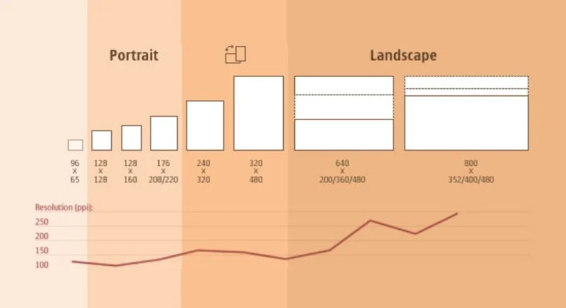
In the landscape of modern Mobile App Development, creating an application that looks and functions flawlessly across a myriad of devices is no longer a luxury—it’s a fundamental requirement. The sheer diversity of screen sizes, resolutions, and orientations presents a significant challenge. Developers must choose a strategy to ensure a consistent and optimal user experience, whether on a compact smartphone, a foldable device, or a large tablet. The two dominant philosophies for tackling this challenge are Responsive Design and Adaptive Design.
While often used interchangeably, these two approaches are fundamentally different in their technical implementation and strategic implications. Choosing the right one can significantly impact development time, maintenance costs, performance, and ultimately, user satisfaction. This article provides a comprehensive technical breakdown of adaptive versus responsive design, specifically tailored for developers working within the Android Development and broader Java Enterprise ecosystem. We’ll explore core concepts, dive into native implementation details with Kotlin and XML, discuss the crucial role of the Java Backend, and outline best practices to help you make the best architectural decision for your next project.
Understanding the Core Concepts: Fluid Grids vs. Fixed Layouts
Before diving into complex code and frameworks, it’s essential to grasp the philosophical difference between responsive and adaptive design. One is about fluidity and flexibility, while the other is about precision and tailoring.
What is Responsive Design?
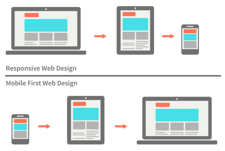
Responsive Design is a client-side approach that aims to create a single, fluid layout that dynamically adjusts to fit any screen size. Think of it like a liquid that takes the shape of its container. It uses a flexible grid system, fluid images, and CSS media queries (in the context of web or hybrid apps) to “respond” to changes in the viewing environment. The core principle is that one codebase and one layout definition should serve all devices, rearranging and resizing content as needed.
This approach gained prominence with web development but its principles are central to modern native UI toolkits. For a hybrid mobile app built with web technologies, a CSS media query is the classic implementation.
/* Default styles for mobile-first approach */
.container {
    width: 100%;
    padding: 10px;
    background-color: #f0f0f0;
}

.main-content {
    width: 100%;
}

.sidebar {
    display: none; /* Hide sidebar on small screens */
}

/* Styles for tablets and larger screens (e.g., screen width > 768px) */
@media (min-width: 768px) {
    .container {
        display: flex;
        max-width: 1200px;
        margin: 0 auto;
    }

    .main-content {
        width: 70%;
        margin-right: 2%;
    }

    .sidebar {
        display: block; /* Show sidebar on larger screens */
        width: 28%;
    }
}
In this example, the layout is a single column on mobile. On screens wider than 768px, the media query activates, transforming the layout into a two-column design by displaying the sidebar and adjusting the widths of the content areas.
What is Adaptive Design?
Adaptive Design, also known as progressive enhancement, takes a different route. Instead of one fluid layout, it involves creating several distinct, fixed-size layouts for specific screen sizes or “breakpoints.” When a user accesses the application, the system detects the device’s screen size and serves the pre-built layout that is most appropriate. Think of it as having a set of different-sized T-shirts (Small, Medium, Large) and giving the customer the one that fits best, rather than one “stretchy” shirt for everyone.
This detection can happen on the client-side (using JavaScript) or server-side. The key takeaway is that it’s not a single, fluid design but a collection of static layouts. Here’s a conceptual JavaScript example for a web-based mobile app that loads different stylesheets based on screen width.
(function() {
    const screenWidth = window.screen.width;
    let stylesheet = 'mobile-styles.css'; // Default

    if (screenWidth > 1200) {
        stylesheet = 'desktop-styles.css';
    } else if (screenWidth > 768) {
        stylesheet = 'tablet-styles.css';
    }

    // Create a new link element for the stylesheet
    const link = document.createElement('link');
    link.rel = 'stylesheet';
    link.type = 'text/css';
    link.href = `/css/${stylesheet}`;

    // Append the link to the head of the document
    document.getElementsByTagName('head')[0].appendChild(link);
})();
This script checks the screen width and dynamically loads the appropriate CSS file, delivering a layout specifically designed for that device category.
Implementation in Native Mobile App Development

While the concepts of responsive and adaptive design originated in the web world, they are directly applicable to native Android Development. Android provides powerful tools to implement both strategies effectively.
Implementing Responsive UI with Jetpack Compose
Modern UI toolkits like Jetpack Compose (Kotlin) and SwiftUI (Swift) are inherently designed with responsiveness in mind. Instead of fixed pixel values, developers are encouraged to use layout modifiers, constraints, and weights to create UIs that naturally flow and adapt. The declarative nature of these frameworks makes building responsive layouts more intuitive compared to the traditional XML approach.
For example, you can use BoxWithConstraints in Jetpack Compose to make decisions based on the available space. This is a powerful tool for creating components that reconfigure themselves based on their parent’s dimensions.
import androidx.compose.foundation.layout.BoxWithConstraints
import androidx.compose.foundation.layout.Column
import androidx.compose.foundation.layout.Row
import androidx.compose.material3.Text
import androidx.compose.runtime.Composable
import androidx.compose.ui.unit.dp

@Composable
fun ResponsiveProfileCard() {
    BoxWithConstraints {
        // this.maxWidth gives us the available width
        if (this.maxWidth < 400.dp) {
            // Use a vertical layout for narrow screens
            Column {
                ProfileImage()
                ProfileDetails()
            }
        } else {
            // Use a horizontal layout for wider screens
            Row {
                ProfileImage()
                ProfileDetails()
            }
        }
    }
}

@Composable
fun ProfileImage() {
    // Placeholder for an image composable
    Text("Image Placeholder")
}

@Composable
fun ProfileDetails() {
    // Placeholder for user details
    Text("User Details Placeholder")
}
In this Kotlin snippet, the ResponsiveProfileCard composable checks its own maximum available width. If it’s narrow (less than 400 dp), it arranges the profile image and details vertically. If it has more space, it switches to a horizontal arrangement. This is a micro-level responsive implementation that makes components more reusable and robust.
Implementing Adaptive UI with Android Resource Qualifiers
The classic Android approach to handling different screen sizes is a perfect example of adaptive design. The Android build system uses resource qualifiers—suffixes added to resource directory names—to target specific device configurations. This allows you to provide completely different layout files, dimensions, or other resources for different screens.
For instance, you can create a layout for a typical phone and a completely different one for a 10-inch tablet. The system automatically selects the correct one at runtime.
Your project’s res directory structure might look like this:
res/
    layout/
        activity_main.xml  (Default layout for phones)
    layout-sw600dp/
        activity_main.xml  (Layout for 7-inch tablets)
    layout-sw720dp-land/
        activity_main.xml  (Layout for 10-inch tablets in landscape)
The sw<N>dp qualifier stands for “smallest width,” providing a robust way to target devices based on their physical screen size. The layout file inside layout-sw600dp might use a LinearLayout with horizontal orientation, while the default uses a vertical one.
<!-- res/layout-sw600dp/activity_main.xml -->
<LinearLayout xmlns:android="http://schemas.android.com/apk/res/android"
    android:layout_width="match_parent"
    android:layout_height="match_parent"
    android:orientation="horizontal">

    <!-- Fragment for a list of items -->
    <androidx.fragment.app.FragmentContainerView
        android:id="@+id/list_fragment"
        android:name="com.example.myapp.ItemListFragment"
        android:layout_width="0dp"
        android:layout_height="match_parent"
        android:layout_weight="1" />

    <!-- Fragment for the details of a selected item -->
    <androidx.fragment.app.FragmentContainerView
        android:id="@+id/detail_fragment"
        android:name="com.example.myapp.ItemDetailFragment"
        android:layout_width="0dp"
        android:layout_height="match_parent"
        android:layout_weight="2" />

</LinearLayout>
This XML layout for a tablet creates a classic master-detail view, something that wouldn’t fit on a small phone screen. This adaptive approach gives developers precise control over the user experience for each device category.
The Role of the Java Backend and Advanced Techniques
The user interface is only one part of the equation. The backend, often built with robust Java Frameworks like Spring Boot, plays a critical role in supporting a seamless multi-device experience.
Designing a Flexible Java REST API
A well-designed Java REST API is crucial. For a responsive UI, the API should be flexible enough to provide all the data the UI might need, allowing the client to decide what to display. For an adaptive UI, you might design different endpoints or use parameters to tailor the data payload for a specific device type. For example, a tablet UI might request more detailed data or larger images than a mobile UI.
Here’s a simple Spring Boot controller that could serve data to our mobile app. Using a framework like Hibernate or JPA for data persistence, this API acts as the backbone for the mobile client.
import org.springframework.web.bind.annotation.GetMapping;
import org.springframework.web.bind.annotation.RequestParam;
import org.springframework.web.bind.annotation.RestController;
import java.util.List;

// Assume a DTO class named ItemDto exists
// Assume a service class named ItemService exists

@RestController
public class ItemController {

    private final ItemService itemService;

    public ItemController(ItemService itemService) {
        this.itemService = itemService;
    }

    @GetMapping("/api/items")
    public List<ItemDto> getItems(
            @RequestParam(value = "deviceType", defaultValue = "mobile") String deviceType) {

        if ("tablet".equalsIgnoreCase(deviceType)) {
            // Fetch more detailed data for tablets
            return itemService.getDetailedItems();
        } else {
            // Fetch summarized data for mobile
            return itemService.getSummaryItems();
        }
    }
}
In this Java Development example, the API endpoint accepts a deviceType parameter. This allows the Java Backend to serve an optimized data payload, reducing network traffic and processing load on smaller devices—a simple but effective server-side adaptive technique.
Performance, UX, and Hybrid Approaches
Performance is a key differentiator. Responsive design can sometimes lead to slower initial load times on mobile, as the device may download assets (HTML, CSS, images) intended for larger screens, even if they are hidden. Adaptive design can deliver a more optimized, faster experience by only sending what’s necessary for that specific device, but at the cost of increased development and maintenance complexity.
In practice, many modern applications use a hybrid approach. They might use an adaptive strategy at a high level (e.g., providing a completely different root layout for phones vs. tablets) while using responsive techniques within individual components to handle minor size variations smoothly. This “best of both worlds” strategy often yields the best results for complex applications.
Best Practices and Choosing the Right Approach
Making the right choice requires a careful analysis of your project’s goals, budget, and target audience.
When to Choose Responsive Design
- Content-Focused Apps: Ideal for blogs, news apps, and informational sites where the primary goal is to present content legibly on all screens.
- Limited Budgets/Timelines: It’s generally faster and cheaper to develop and maintain a single responsive layout than multiple adaptive ones.
- Consistency is Key: When you want a uniform brand experience and user flow across all devices.
- Future-Proofing: A fluid responsive design will likely work well on new screen sizes without modification.
When to Choose Adaptive Design
- Complex, Task-Oriented Apps: When the user’s context and interaction model change significantly between devices (e.g., a creative suite or a data dashboard).
- Performance is Critical: When you need to deliver a highly optimized experience with the fastest possible load times for each device class.
- Targeted UX: When you want to leverage device-specific capabilities (like a stylus on a tablet) and create a truly tailored user journey.
- Retrofitting Existing Apps: It can be easier to add new adaptive layouts to an existing, non-responsive app than to refactor the entire codebase to be responsive.
Common Pitfalls to Avoid
- Responsive Pitfalls: Overly complex media queries, poor performance from unoptimized images, and layouts that “break” at awkward in-between sizes.
- Adaptive Pitfalls: High maintenance overhead (updating multiple layouts), a disjointed user experience between devices, and failing to account for a new device that falls between your predefined breakpoints.
Conclusion: A Strategic Decision
The debate between adaptive and responsive design is not about which is universally better, but which is the right tool for the job. Responsive design offers efficiency and consistency through a single, fluid layout, making it a strong choice for content-driven applications and projects with tight constraints. Adaptive design provides precision and performance by delivering tailored layouts for specific devices, making it ideal for complex, context-aware applications where the user experience is paramount.
As a developer in the Java and Android ecosystem, understanding both methodologies is crucial. By leveraging modern tools like Jetpack Compose for responsive components, traditional resource qualifiers for adaptive layouts, and a robust Java Spring backend, you can architect mobile applications that are not only functional but also delightful to use on any device. The best approach always starts with a deep understanding of your users and a clear vision for the experience you want to create.